Correlation
Correlation is a
method of characterizing the similarity of
the contour of two sequences of numbers. In its most basic form,
correlation is the sum of the multiplication between corresponding
numbers in a pair of sequences:

To normalize the resulting correlation values into the range
from -1.0 to +1.0, use Pearson's product moment correlation:

Correlation Examples
Here are some example correlation calculations to give an idea
for how correlation values correspond to curves.
First consider the simplest case of comparing two
sequences with two numbers. In the following figure the first
pair of lines are slanted in the same direction. This causes
the correlation value to be +1.0. The correlation value is
often called the r-value in statistics, so in this case
the text "r=1" means the correlation is 1.0.
In the second example of the following figure the lines
have opposite slopes (the first is pointing up, and the second
is pointing down). In this case the lines are negatively correlated.
 The following set of examples demonstrates that normalized
correlation (Pearson correlation) measures the gross contour of a
pair of line. In this case the slope of the second line is varied;
however, the correlation value remains constant at the maximum
correlation.
The following set of examples demonstrates that normalized
correlation (Pearson correlation) measures the gross contour of a
pair of line. In this case the slope of the second line is varied;
however, the correlation value remains constant at the maximum
correlation.
 Also notice that a Pearson correlation
for a purely horizontal line (sequence with all numbers the same)
cannot be caculated becase one or both of the terms inside the
square root of the denominator is 0, making the entire value
become 0/0 which is an undefined number. In the program which
generates plots described below from the correlation values, the
number 0/0 is assigned to be the correlation value 0.0.
Also notice that a Pearson correlation
for a purely horizontal line (sequence with all numbers the same)
cannot be caculated becase one or both of the terms inside the
square root of the denominator is 0, making the entire value
become 0/0 which is an undefined number. In the program which
generates plots described below from the correlation values, the
number 0/0 is assigned to be the correlation value 0.0.
The following figure demonstrates the correlation values for
several sequences of length 3.
 Finally, here is a demonstration of correlation for longer
sequences behaves. In the following example, the red curve
is a smooth arch consisting of 11 numbers. The blue
curve represents a second sequence which consists of the
numbers from the red curve plus a random offset which is
gradually increased in the pairs of curves in the figure.
Notice that for small random fluxuations, the correlation
remains high, but as the randomness of the blue curve
increases, the correlation between the two sequences drops.
Finally, here is a demonstration of correlation for longer
sequences behaves. In the following example, the red curve
is a smooth arch consisting of 11 numbers. The blue
curve represents a second sequence which consists of the
numbers from the red curve plus a random offset which is
gradually increased in the pairs of curves in the figure.
Notice that for small random fluxuations, the correlation
remains high, but as the randomness of the blue curve
increases, the correlation between the two sequences drops.

Hierichical Correlation Plots
One problem that occurs when correlating two sequences
is that a single number cannot describe in any detail
the similarity of two sequences. Correlation can only
describe the overall similarity of the two sequences when
both are consider in their entirity. Consider the following
two sequences (one in red and the other in blue):
 The correlation between these two sequences is 0.235. This means that
the two sequences are slightly similar to each other. This value is
virtually meaningless, and two mostly random sequences could also generate
a similar correlation value. The fact that there are two arches in the
blue sequence and one arch in the red sequences cannot be described in
the single correlation number. In order to do this sort of comparison,
the two sequences have to be chopped up into smaller pieces. For example,
the sequences could be divided into three sections:
The correlation between these two sequences is 0.235. This means that
the two sequences are slightly similar to each other. This value is
virtually meaningless, and two mostly random sequences could also generate
a similar correlation value. The fact that there are two arches in the
blue sequence and one arch in the red sequences cannot be described in
the single correlation number. In order to do this sort of comparison,
the two sequences have to be chopped up into smaller pieces. For example,
the sequences could be divided into three sections:

In this case when dividing the sequences up into the first
25%, the middle 50% and the last 25%, three high correlation values
pop out of the sequences rather than one slightly positive correlation
values.
To examine the internal similarity of two sequences,
cut the sequences up into smaller pieces. For example,
if both sequences have six numbers {A,B,C,D,E,F}, then
{A,B,C}, {D}, {C,D,E,F} and {A,B,C,D,E} are all sub-sequences
which can be correlated in addition to the entire sequence.
How many sub-sequences should the two sequences be cut
up into? In the above example, using three unequal segments
best demonstrates the internal structure between the two sequences.
However, in the general case where you do not know anything about
the internal structures of the two sequences beforehand, it is best
to segment the sequences into all possible sub-sequences.
The following plot schematic shows a two-dimensional
plot which can display all of these sub-sequence correlations
simultaneously. Note that the bottom row is not displayed
in actual plots, and is just shown for reference to the original
sequence
(correlation with a single number isn't interesting).

Alternatively, each row can be stretched to create a
rectangular plotting region:

Plot Colorization
Using Pearson's product moment correlation, the
correlation values will be in the range from -1 to +1. This
range can be colored with one range from -1 to +1, or it can
be colored with two ranges: one from 0 to -1, and another
from 0 to +1. Here are three possible coloration schemes
for the hierarchical correlation plot (which could also
be reversed):


Alternatively, in order to view more subtle changes
in correlation, more colors can be fitted into the
range between -1 and +1, such as using a hue value:

Where red/orange = high correlation, yellow = moderate correlation,
green = slight correlations, light blue = slight negative correlation,
dark blue = moderate negative correlations, and purple = strong negative
correlation.
Example Hierarchical Correlation Plots
Now recall the double and single arch sequences from a previous
section. Here is a hierarchical correlation plot of those
sequences, with the two sequences underneath for reference.

In the plot, high correlation is displayed as white, high negative
correlation is displayed as black, and low correlation is displayed
as gray. The plot now clearly demonstrates the three interesting
sub regions of the pair of sequences. The far left and right sides
of the plots are white which indicates that the two sequences are
strongly correlated at their beginnings and ends. The dark central
region indicates that they are strongly anti-correlated (doing opposite
things) in the central region. This is where the red curve rises
when the blue curve false, and vice-versa.
Example Temposcape Plots
A comparison of the beat-by-beat performance tempos for
Chopin's Mazurka in F major, Op. 68, No. 3. Click on the
thumnail images in order to view a large version of the plot.
Here are hue-colored plots of the same correlation comparisons.
(The hue values need correcting).
Here are rectangular plots of the same hue plots above:
Polycorrelation plots
The basic method of plotting the correlation between two
performances can also be extended to comparisons between multiple performances.
In this case a color is displayed to indicate which of several sequences
is closeset to the original sequence.
The following polycorrelation plots are shown for each performer.
The colors in the plot represent the closest performance according to the
correlation measurement at the given point in the plot. The colors represent
the following performances:

 Chiu 1999
|
 Indjic 2001
|
 Luisada 1991
|
 Rubinstein 1938
|
 Rubinstein 1961
|
 Smith 1975
|
The most interesting plots here are Rubinstein 1938 and
Rubinstein 1961. In this case both plots show in the first half
of the performance, that they are each the best fit to each other.
In the Rubinstein 1938 plot, the dark blue represents the Rubinstein
1961 performance. The dark blue color progresses from the bottom
of the plot to the top of the plot. Likewise with the light blue coloring
of the Rubinstein 1961 plot.
If colors progress from the bottom to the top then that is a good
case for influence between the performances. Colors found at the top
of the picture which are not connected to the same color at the bottom
of the plot shows an large-scale structural similarity, but not related
to any surface similarities. In this case it is more likely that the
similarity results from indirect influence on the performance, or there
is no influence at all between the performances.
Other items of interest:
- The bands of purple and red in the Indjic
2001 plot are on the phrase level which is perhaps demonstrating
the change of (tempo) performance style between successive phrases.
- The Chiu plot shows potential influence from the Rubinstein 1961
recording with the moderately significat amounts of dark blue in the
beginning and ending sections.
The absolute correlation values of the most similar performance
can also be superimposed onto the polycorrelation plots to indicate
the stregth of the correlation between the two performances. In the
following plots, the brighther colors indicate a stronger correlation
value, while a darker color indicates a weaker correlation.
 Chiu 1999
|
 Indjic 2001
|
 Luisada 1991
|
 Rubinstein 1938
|
 Rubinstein 1961
|
 Smith 1975
|
In these example plots, the Smith 1975 performance shows the least
comonality with the other performances. The Indjic 2001 performances
does not show any strong correlation with other performances on the
low level, but the large-scale tempo structure strongly resembles
the Luisada 1991 performance.
Hierarchical Average Plots
These are arranged in a similar manner as the correlation plots,
but the average value of a single sequence is displayed rather
than the correlation between two sequences.
 Chiu 1999
|
 Indjic 2001
|
 Luisada 1991
|
 Rubinstein 1938
|
 Rubinstein 1961
|
 Smith 1975
|
In these plots, the poco più vivo section is displayed in white since it is
faster than the average tempo of the piece. Black regions at the bottom
of the pictures indicate where the tempo slows down at phrase boundaries.
Of note:
- Smith 1975 has very arched phrasing. playing the middle of phrases
faster, and the phrase endings slower. Smith 1975 also does a
- Indjic 2001 is also very regularly phrased, even more so than
Smith 1975. In the return of the A section at the end of the piece
(the last two phrases), the phrases are slightly less arched, and they
show a tendancy to be double phrases (with a slow down in the middle
of the 8 bar period) which is less prominent in the opening of the piece.
- Notice that the more recent performances smooth out the high-level
tempo averages. Indjic and Luisada are smooth at the top of the
plots, Smith 1975 is chunky, but fairly smooth, and both Rubinsteins
are much more striated at the top levels.
- Chiu 1999 shows a tendance to break phrases into 4 bar fragments
which is in particular contrast to Smith 1975 which generally
shows 8-bar phrasing.
Here are the same performances plotted with a logarithmic vertical
scale:
 Chiu 1999
|
 Indjic 2001
|
 Luisada 1991
|
 Rubinstein 1938
|
 Rubinstein 1961
|
 Smith 1975
|
Here are the same plots displayed in color:
 Chiu 1999
|
 Indjic 2001
|
 Luisada 1991
|
 Rubinstein 1938
|
 Rubinstein 1961
|
 Smith 1975
|
And the same plots displayed in color on a vertical log scale:
 Chiu 1999
|
 Indjic 2001
|
 Luisada 1991
|
 Rubinstein 1938
|
 Rubinstein 1961
|
 Smith 1975
|
The hue colorizations don't show as much of the phrasing structure
as the plain black and white pictures, but they do demonstrate the
contrast between older and newer performances. The newer performances
show in the top row have a greater contrast between slow and fast
tempos. The bottom three older performances show less of a contrast
between slow and fast sections (demonstrated by the smaller red section
of the vivo section).
Below is a pair of plots which represent an average performance
for the mazurka which was created by averaging the note-by-note tempos
before generating the plots. Notice that the average performance closely
matches the Chiu 1999 performance.
Average Difference Plots
The average tempos of mazurka performances consistently slow down
over time. The following figure shows that for all mazurkas which have
currently been analyzed, the average tempo drops about 3 beats per
minute over each decade.
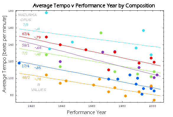
For example, here are the average tempos for Mauzurka in
F major, Op. 68, No. 3:
| performer | year | | tempo |
| Indjic | 2001 | | 105 |
| Chiu | 1999 | | 115 |
| Luisada | 1991 | | 105 |
| Smith | 1975 | | 129 |
| Rubinstein | 1961 | | 129 |
| Rubinstein | 1938 | | 134 |
But what does it mean for a performance to be slower or faster than
average compared to another performance. How is it slower or faster?
In other words, is the difference just due to a constant change such
as slowing down the speed of a record, or does the difference in
tempo change clump in certain regions of the performance.
The following hierarchical average tempo difference plots address
this problem of characterizing the change in average tempos between
performances.
The following plots compare the tempos of a pair of performances.
If the first performance is faster than the second performance at a
give time-scope in the piece, the plot is colored red (i.e., red =
hotter; faster). If the first performance is slower, then the plot
is colored blue (i.e., blue = cooler; slower). If the tempos are the
same, the plot is colored white (the same within one beat per minute,
but this is not important for this particular plotting scheme).
In these plots, the comparison of average tempos for the entire
performance is displayed in the top-most corner of the triangle
plots. For example when comparing Indjic 2001 with Chiu 1999, the
top of the triangle is colored blue because Indjic's average tempo
of 105 is slower than Chiu's average tempo of 115 MM. Likewise,
when comparing Chiu 1999 to Indjic 2001, the same region is colored
red because 115 is a faster tempo than 105. (notice that in the
following grid of comparisons, the bottom left half is a color mirror
of the top right half).
| |
indjic2001 |
chiu1999 |
luisada1991 |
smith1975 |
rubinstein1961 |
rubinstein1938 |
| indjic2001 |
|

|

|

|

|

|
| chiu1999 |

|
|

|

|

|

|
| luisada1991 |

|

|
|

|

|

|
smith1975 |

|

|

|
|

|

|
| rubinstein1961 |

|

|

|

|
|

|
| rubinstein1938 |

|

|

|

|

|
|
Notice in the grid of comparisons above that the older performances
have a predominantly red color for the plots, which indicates that they
are mostly faster than more recent performances. However, their plots
are not solid red, which would be indicative of a tempo which is continually
faster for all beats and sections throughout the performance.
Note in particular that the poco più vivo sections of the
mazurka which occurs just after the mid point in the composition is
nearly always demarked between performance comparisons. So while the
more recent performances have been slowing down, the tempo of the vivo
section has been increasing. It is the non-vivo parts of the composition
which are slowing down, and there is an increase in the tempo range
throughout the piece which is facilitated by a decrease in overall tempo.
Here is a table showing the average tempo, as well as the
tempo of the vivo and non-vivo parts of the composition which is
a better characterization of the tempo changes:
| performer | year | | avg tempo | non-vivo avg. | vivo avg |
| Indjic | 2001 | | 105 | 68 | 171 |
| Chiu | 1999 | | 115 | 73 | 198 |
| Luisada | 1991 | | 105 | 66 | 187 |
| Smith | 1975 | | 129 | 78 | 249 |
| Rubinstein | 1961 | | 129 | 81 | 225 |
| Rubinstein | 1938 | | 134 | 86 | 224 |
Contoured Average Difference Plots
The following set of plots compare the tempo differences in a
more refined manner. The previous section only disinguished between
two states of faster or slower. The following plots give a better
quantative feel for the differences in tempo between two performances
by coloring the plot according to percent change using the following
mapping:

| |
indjic2001 |
chiu1999 |
luisada1991 |
smith1975 |
rubinstein1961 |
rubinstein1938 |
| indjic2001 |
|

|

|

|

|

|
| chiu1999 |

|
|

|

|

|

|
| luisada1991 |

|

|
|

|

|

|
smith1975 |

|

|

|
|

|

|
| rubinstein1961 |

|

|

|

|
|

|
| rubinstein1938 |

|

|

|

|

|
|